Typography

Typography is a centuries-old art. Until the end of the 14th century, the handwriting was used to write. It is both an art and a technology for visual language recognition.
"Typography" is coming from Greek words. "Typos" (from) and "Graphe" (writing).
Typography is the design of the characters that make up the text and display type and the way they are configured on the page.
Italic: A slanting version of a typeface; meant to accompany the Roman style letters Usually slant at a 12–15-degree angle
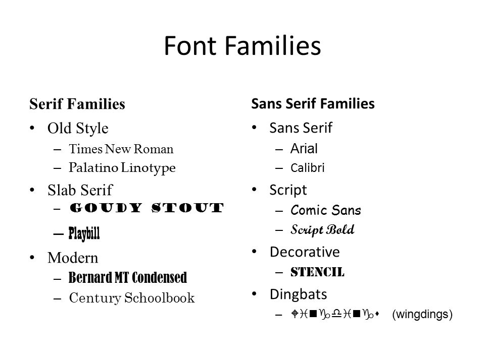
Serif: A serif is the pointed ending of a stroke as in “I” or “T”. This is inspired by the letters carved on stone, using chisels. The thickness of the strokes also changes in these letterforms, like those drawn by flat brushes. Serif fonts are known for their readability and are widely used in text composition for books, newspapers, magazines, etc, where a large amount of text is to be composed in small point sizes.
Sans Serif: Sans means without. Sans serif means without Serif. Sans serif fonts have blunt endings to the strokes. Almost all the strokes look like equal thickness as if drawn by a marker pen. Sans serif fonts give a modern look and are widely used in logos and symbols, packaging, signages, websites, mobile phone interfaces, gaming consoles, etc.
Script: Script fonts recreate the visual styling of calligraphy. The letters imitate the feeling of calligraphic nibs, with a slant to the right and changing thickness of strokes. These fonts give a festive and personal look to the reader and are very commonly used in wedding invitations.
Typographic Terms


Multilingual Typography

In
some contexts like Signage systems and logotypes, the text is
composed in more than one language.
Example;

Designers choose fonts from different languages carefully, so that the result in a harmonious visual.
A visual comparison should be done before finalizing fonts from different languages to be used in a single visual. Comparison of stroke width, x-height and counter space is an important activity in multilingual typography.
"Typography" is coming from Greek words. "Typos" (from) and "Graphe" (writing).
Typography is the design of the characters that make up the text and display type and the way they are configured on the page.
The
3 main goals of typography:
- Readability
- Transfer information to the reader in an efficient manner.
- Use
“type” to provide a sense of order and structure that makes
logical and visual sense.
Why is typography?
We do many things for the day-to-day use of text and words. How do you get newspapers, posters, ticket, books that you see or use every day? When you message a friend through your smartphone, send emails, making presentation slides, reports, we use various text, fonts, and characters to express the message we need.
For example, even in writing this blog I have used various fonts, font size, characters, Bold, Italic ... etc. Surely it may seem a bit minor, but even the smallest changes affect your mind and feelings.
Typeface and Font?
A Typeface is a family of typographical symbols and
characters. Refers to the upper and lowercase letters and numbers of a specific design/ font.
Helvetica, Bodoni, Futura, Verdana, Myriad, Arial, etc.
A Font is traditionally defined
as a complete character set within a typeface, often of a particular
size and style.
Typestyles


Roman:
Upright letterforms; represents the majority of typeset copy
Italic: A slanting version of a typeface; meant to accompany the Roman style letters Usually slant at a 12–15-degree angle
Oblique: Type that is
simply slanted to the right
Regular(Normal):
The standard weight of a typeface
Light(Thin): A thinner/ lighter version of the regular typeface.
Bold: A thicker, heavier version of the regular typeface
In English, fonts are classified into several groups.


Serif: A serif is the pointed ending of a stroke as in “I” or “T”. This is inspired by the letters carved on stone, using chisels. The thickness of the strokes also changes in these letterforms, like those drawn by flat brushes. Serif fonts are known for their readability and are widely used in text composition for books, newspapers, magazines, etc, where a large amount of text is to be composed in small point sizes.
Sans Serif: Sans means without. Sans serif means without Serif. Sans serif fonts have blunt endings to the strokes. Almost all the strokes look like equal thickness as if drawn by a marker pen. Sans serif fonts give a modern look and are widely used in logos and symbols, packaging, signages, websites, mobile phone interfaces, gaming consoles, etc.
Script: Script fonts recreate the visual styling of calligraphy. The letters imitate the feeling of calligraphic nibs, with a slant to the right and changing thickness of strokes. These fonts give a festive and personal look to the reader and are very commonly used in wedding invitations.
Typographic Terms
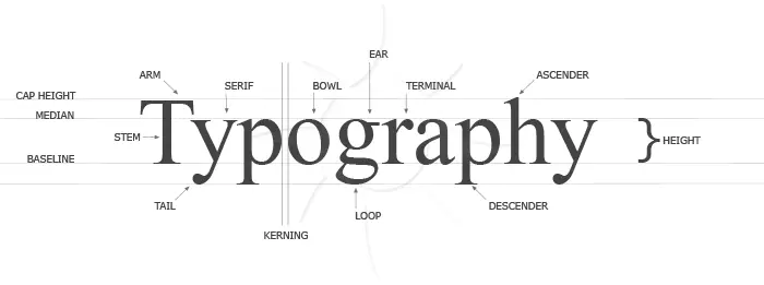
Characters: The
individual letters, numbers, and punctuation used when setting type
Uppercase: The
capital letters of the alphabet
Lowercase: The
small letters of the alphabet
Baseline: An
imaginary line on which the characters seem to be standing
Mean line: The
imaginary line that runs along the top of most lowercase letters,
such as i, c, e, m, n, u,v, w, and x
such as i, c, e, m, n, u,v, w, and x
X-Height: The
height of the body or main element of the lowercase letterform, which
falls between the mean line and the baseline
Cap
Height: The imaginary line that runs across the top of
capital letters and ascenders in a line of type
Descender: The longest point in a letter that falls beyond the baseline.
Ascender: The portion of a letter that extends above the mean line of a font.
Ligature: The stroke that joins adjacent letters.
Bowl: The curved part of the character that encloses the circular or curved parts of some letters, like,' 'b,' 'o,' 'D,' and 'B.'
Kerning

Kerning is the modification of the space between two letters.
Tracking
Similar to kerning, tracking deals with a modification to letter spacing. However, instead of adjusting the spacing between just two letters, tracking is an adjustment to the spacing between all letters an entire word.
Leading
The terms “single-space” and “double-space” can also be called “leading,” which is the distance between the baselines.
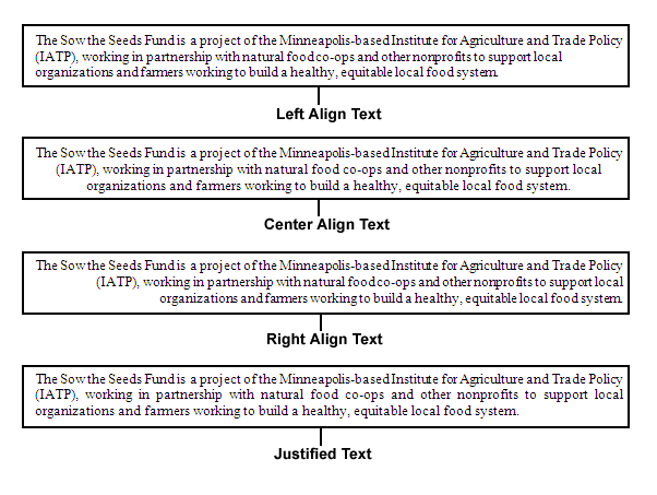
Text Alignment

Text can be composed of different alignments. Usually, the text
is aligned in one of the following ways:
1. Left-aligned
2. Justified
3. Centralized
4. Right aligned
Towards a New Age Graphic Design
Justified setting forces all composed lines to start and end in
a specific area, which results in the final composition look like
a box. Justified text is also called “box set”. This setting
is very popular in textbooks, newspapers, and magazines
and helps to fit more text in a given space. However, this can
cause ugly white spaces between words and letters, called
“River” and “Bubble”.

Bubble
An unwanted ugly white space which appears between words.
River
A series of white spaces or Bubbles make an ugly white line
in a paragraph, called a river. This too causes discomfort in
reading.

Example;
Designers choose fonts from different languages carefully, so that the result in a harmonious visual.
A visual comparison should be done before finalizing fonts from different languages to be used in a single visual. Comparison of stroke width, x-height and counter space is an important activity in multilingual typography.
T h a n k Y o u! 😊
- Kau -


Comments
Post a Comment